Plotting the results#
The pypfilt.plot module provides functions for plotting observations
and credible intervals, and classes for constructing figures with sub-plots.
For example, we can use the Wrap class to plot the simulation model fits and forecasts against the simulated observations for \(x(t)\), \(y(t)\), and \(z(t)\):
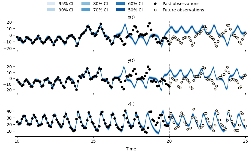
Forecasts for \(x(t)\), \(y(t)\), and \(z(t)\) of the Lorenz63 system at time \(t=20\).#
Note
You may prefer to use a dedicated plotting package such as plotnine.
We can see that between \(t=15\) and \(t=20\), the simulation model is no longer able to fit the simulated observations (black points), and the forecasts do not characterise the future observations (hollow points). This is due to particle degeneracy, a situation where very few (if any) particles are consistent with the available observations.
In the next section we will see one way to mitigate this issue.
Note
Whenever the particles are resampled, the particles with the largest weights (i.e., those that best describe the past observations) will be duplicated. Because the simulation model is deterministic, these duplicate particles will produce identical trajectories, and so the particle ensemble will comprise fewer and fewer unique trajectories, representing a smaller and smaller subset of the original samples drawn from the model prior distribution.
def plot_lorenz63_forecast(results, obs_tables, plot_file):
    """
    Plot credible intervals for x(t), y(t), and z(t) against observations.
    """
    backcast_time = 10
    forecast_time = 20

    # Collect credible intervals for the recent backcast and the forecast.
    fit = results.estimation.tables['forecasts']
    forecast = results.forecasts[forecast_time].tables['forecasts']
    credible_intervals = np.concatenate(
        (fit[fit['time'] >= backcast_time], forecast)
    )

    # Collect the simulated observations that were used to fit the model.
    backcast_obs = {
        unit: table[
            np.logical_and(
                table['time'] >= backcast_time,
                table['time'] <= forecast_time,
            )
        ]
        for (unit, table) in obs_tables.items()
    }

    # Collect the simulated observations over the forecast horizon.
    future_obs = {
        unit: table[table['time'] > forecast_time]
        for (unit, table) in obs_tables.items()
    }

    # Plot the backcast and forecast against the simulated observations.
    matplotlib.use('Agg')
    with pypfilt.plot.apply_style():
        plot = pypfilt.plot.Wrap(
            credible_intervals,
            'Time',
            '',
            ('unit', lambda s: '{}(t)'.format(s)),
            nc=1,
        )

        plot.expand_x_lims('time')
        plot.expand_y_lims('ymax')
        plot.fig.subplots_adjust(hspace=0.5)

        obs_size = 25.0

        for ax, df in plot.subplots():
            # Plot each forecast credible interval.
            hs = pypfilt.plot.cred_ints(ax, df, 'time', 'prob')

            # Plot the observations up to the forecasting time.
            hs.extend(
                pypfilt.plot.observations(
                    ax,
                    backcast_obs[df['unit'][0]],
                    label='Past observations',
                    s=obs_size,
                )
            )

            # Plot the observations after the forecasting time.
            hs.extend(
                pypfilt.plot.observations(
                    ax,
                    future_obs[df['unit'][0]],
                    future=True,
                    label='Future observations',
                    s=obs_size,
                )
            )

            plot.add_to_legend(hs)

            # Add a vertical line to indicate the forecast time.
            ax.axvline(
                x=forecast_time, linestyle='--', color='#7f7f7f', zorder=0
            )

            # Adjust the axis limits and the number of ticks.
            x_range = df['time'].max() - df['time'].min()
            x_expand = x_range * 0.01
            ax.set_xlim(
                left=df['time'].min() - x_expand,
                right=df['time'].max() + x_expand,
            )
            ax.locator_params(axis='x', nbins=6)
            ax.set_ylim(auto=True)
            ax.locator_params(axis='y', nbins=6)

        plot.legend(loc='upper center', ncol=4, borderaxespad=0)

        # NOTE: do not save the matplotlib version in the image metadata.
        # This ensures the images are reproducible across matplotlib versions.
        plot.save(
            plot_file,
            format='png',
            width=10,
            height=5,
            metadata={'Software': None},
        )